The Tales Behind the Branding of 32 Storied Book Publishers

Note: an edited version of this essay may also be found on Design Observer.
Logos fight for center stage in the theatre of our attention — but not when we’re holding a book. Publishing houses tuck their marks away. Each book is an autonomous property, best known by its cover — more than ever, in the flat light of the internet. Most readers can’t tell you who published the books that they hold dear — our relationship is with the author. And yet publishing firms have been thoughtfully crafting their identities for 500 years. A broad data set positioned in a curious corner of the branded landscape. When viewed chronologically, patterns of thought become apparent across the field. What follows is a survey of the logic behind these logos. Why was the symbolism chosen and how did that symbolism evolve over time? The answers produce stories, which speak volumes about the entwined histories of book publishing and brand strategy.
Fust & Schöffer (est. 1457)
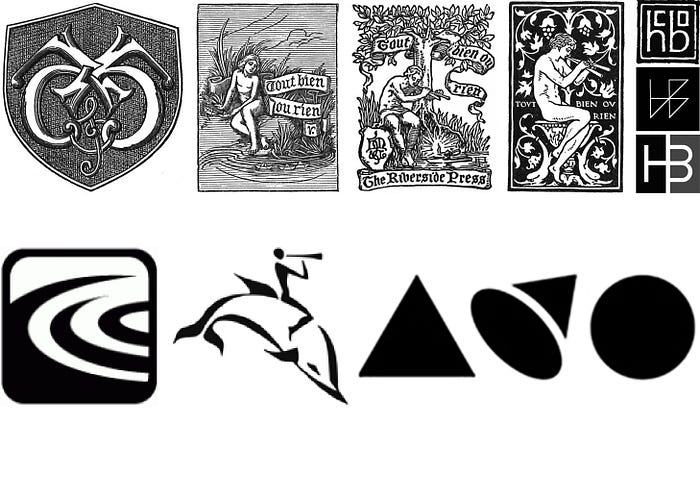
Johann Fust and his son-in-law Peter Schöffer employed the first printer mark when they established their firm in 1457, four years after Gutenberg produced the first typographically printed book. Twin shields hanging from a branch — each one sporting a Greek letter to represent their respective families.

Aldine Press (est. 1494)
The image of a dolphin wrapped around an anchor that Aldus Manutius chose for Aldine Press is a visual metaphor for “Fastina Lente” — the Roman version of the classical Greek motto, which is often translated into English as “More Haste, Less Speed.” A silver medal of Vespasian featuring the dolphin and anchor, which was gifted to Manutius by Cardinal Pietro Bembo, was likely the inspiration for its adoption. Anybody who has worked for a publisher will recognize that the oxymoron in the metaphor cleverly captures the spirit of book production. Manutius understood and appreciated books from every angle. He invented italic type, the portable octavo trim size, and was renowned for the quality of his craftsmanship. The appropriateness of his logo’s adage and his reputation for invention and precision are evidenced by the great number of presses that employed the dolphin and anchor after him. For example, Antoine Tardif (est. 1584), Chiswick Press (est. 1787), William Pickering (est. 1820), and Doubleday (est. 1897). In addition to its anchor and dolphin Chiswick’s colophon featured a lion, likely in reference to the Wittingham coat of arms.

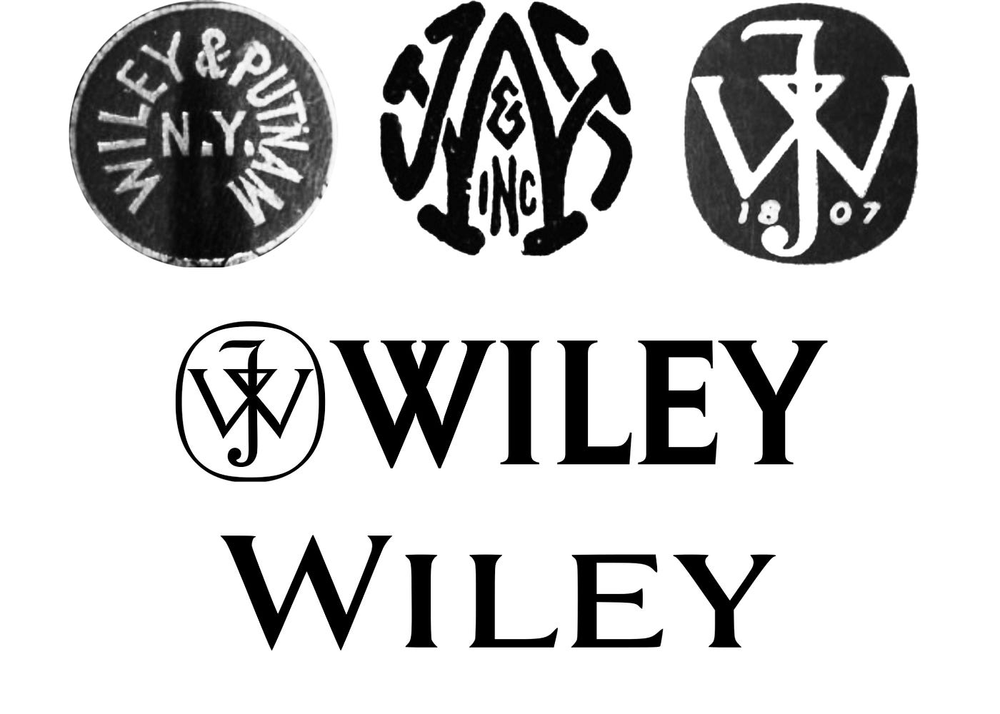
John Wiley & Sons (est. 1807)
Charles Wiley began by opening a print shop in Manhattan. Charles’ son John took over the business when his father died in 1826. For the next 147 years the firm ran through a series of family members and partners and largely represented itself by simply typesetting the firm’s name, or by employing various monograms. In 1954 they established the distinctive JW monogram that would mark the company through the end of the 20th century. Sometime in the past six years — the change was not widely publicized — they dropped the monogram and retooled the logotype returning to their straightforward typeset roots.
Harper & Row (est. 1817) and William Collins, Sons (est. 1819)
There are two stories behind the waves and flames of HarperCollins. The mark represents the blending of two firms — Harper & Row and William Collins, Sons. In 1817 James and John Harper opened a print shop. Before long they began publishing their own books and adopted a colophon that featured a torch changing hands. It was supported by a quote from Plato’s The Republic which refers to a torch race: “Running in the race they pass the torch one to another.” In 1962 the firm merged with Row, Peterson & Company to form Harper & Row. They retained the mark of the flame but abandoned the connection to Plato and the core idea of the flame being passed — that is until it was passed to William Collins, Sons.
It is difficult to find a record of the reasoning behind the fountain mark of William Collins, Sons. That said, in 1881 when the firm was still branded by their family coat of arms, a fountain was built in Glasgow to honor Sir William Collins II — the son of the firm’s founder. We can hazard a guess that the trademark and landmark are the same fountain.

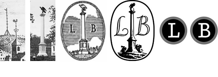
Little Brown & Co. (est. 1837)
Little Brown’s original colophon featured an illustration of the Charles Bulfinch monument atop Beacon Hill in Boston — where the firm was originally located. The monument commemorated the location of the city’s earliest alarm system — a beacon to announce a fire or attack. In 2009 — after 172 years — the original mark was replaced by a logo inspired by a typewriter’s keys.
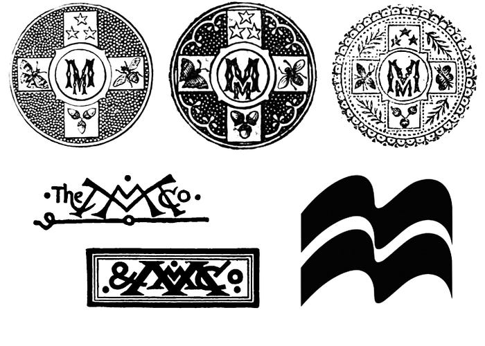
Macmillan (est. 1843)
It is difficult to find mention of the who and why behind Macmillan’s mark but the graphic record allows us to unpack a narrative. Starting as bookstore owners, the Macmillan brothers eventually began publishing works that were branded with a monogram. The monogram evolved over many years but always retained a prominent double “M.” Eventually the two “Ms” made the leap to become the iconic banners that they are today.
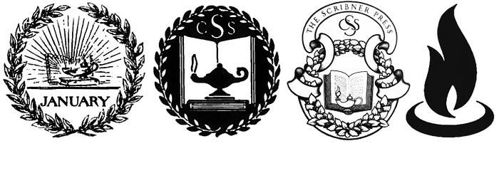
Charles Scribner’s Sons (est. 1846)
Charles Scribner and Isaac Baker founded Scribner and Baker in 1846 but it wasn’t until the firm launched Scribner Magazine in 1887 that the book, lamp, and laurel colophon — designed by the architect Stanford White — first appeared. Charles Scribner III reflected on the symbolism in an unpublished memo 107 years later, “The symbol of the book hardly needs to be explained; the laurel crown is a symbol of the highest achievement [in the arts]…the lamp is not Aladdin’s lamp but rather the lamp of wisdom and knowledge.” The three-pronged mark was updated by the architect Maxfield Parrish in 1902 when the magazine became a press. It was updated again by the designer Rudolph Ruzicka in 1953, and was later reduced to a lone flame by Pentagram in 1996.
Houghton Mifflin (est. 1864) and Harcourt (est. 1919)
Houghton Mifflin Harcourt is another house that combines the stories of two other firms. The original Hurd & Houghton monogram was drawn by Charlotte Stevens, daughter of Charles Wittingham — the aforementioned founder of Chiswick Press. When the name changed to Houghton Mifflin in 1872, they altered her original drawing to include an “M,” but Houghton also owned the Riverside Press and the line between the brands was blurry. Riverside Press, located on the Charles River, was renowned for elevating the craftsmanship of American book publishing — its motto was Tout bien ou rien, “Do everything well or do nothing.” When Houghton Mifflin published Edward FitzGerald’s translation of Omar Khayyám’s poetry they hired Elihu Vedder to illustrate the deluxe edition. The colophon featured the image of a boy pushing paper boats into a stream next to Riverside’s motto — a clever visual metaphor for publishing. Houghton Mifflin began employing the illustration as their official mark in 1885 but then in the fall of that year they hired Sidney L. Smith to revise the scene. The boy was handed a flute and now coaxed vessels ashore instead of launching them into the current. Over the years they produced many renditions of the young flutist including a version set within in a floral frame with dolphins at his feet.
Initially founded as Harcourt, Brace and Howe the masthead was reduced to Harcourt, Brace and Company in 1921. Over the next 70 years the company leaned on the square monographic device through myriad mergers and named partners, hiring the likes of Paul Rand to design them. Sometime in the 1990s Harcourt pivoted to an image of rippling water. It is difficult to find a record of the thinking behind this decision. In 2007 Harcourt was acquired by Houghton Mifflin, which chose to add the Harcourt name alone to their own flutist/dolphin symbolic history. Then in 2013 HMH made a hard break from that history in a redesign executed by Lippincott. The new identity tells the simple geometric story of a triangle rotating into a circle — a stepped narrative that is meant to convey curiosity.
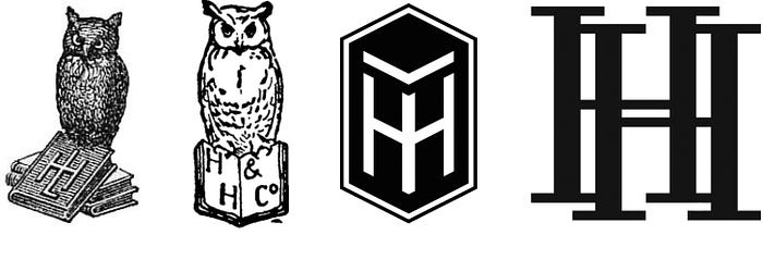
Henry Holt & Co. (est. 1866)
Frederick Leypoldt tapped the painter John LaFarge to draw for his house an owl quite simply because it was thought to be “the bird of wisdom.” The owl watched over a book marked by the letters L and H (the house was originally known as Leypoldt & Holt). LH became HH upon Leypoldt’s exit from the firm. While there were many variations on the owl with book motif, the general story arc describes a flight towards simplification. First the watchful owl fell from the monogramed book and then the double H stepped out of the book to stand alone.
Doubleday (est. 1897)
The Doubleday family ran through a series of publishing partners and colophons built from trees, books, and laurels before landing on the decision to co-opt the anchor and dolphin wholesale from Aldus Manutius’ Aldine Press (est. 1494). On its face it seems the aim was to imbue Doubleday with Manutius’ reputation for quality and innovation — and it was that — but the anchor symbol was also a direct response to the firm’s own history. In 1927 Doubleday merged with George H. Doran Co. to form Doubleday Doran. Doran brought a water symbolism, which had been absent from Doubleday to that point. The new firm landed on a mark that featured an anchored boat with a man pointing at the house’s double D initials. In 1946 when the company changed its name to Doubleday & Co. it dropped a D. Then in 1954, when Ken McCormick and Jason Epstein founded Anchor Books, the scene was reduced to anchor and initials alone for their imprint. It was from there that they jumped to Aldine’s colophon — a logo that went on to represent the whole company.

Knopf (Est. 1915), Heinemann (est. 1890), and Androw Myllar (est. 1507)
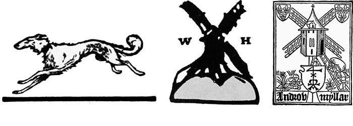
“When I started in business the publisher I admired most was London’s William Heinemann, and the sign of a Heinemann book was a windmill, drawn for him, I think, by William Nicholson. Since a windmill obviously had nothing to do with books, I saw no reason why we could not adopt the Borzoi as our mark.” — Alfred Knopf
Also known as Russian Wolfhounds, the Borzoi, as described by the American Kennel Club, is a “regally dignified, loyal, and affectionate” breed. Blanche Knopf (née Wolf) suggested the Borzoi — possibly in reference to her maiden name — prior to owning one. Amusingly, after owning a Borzoi she described the breed as “stupid, disloyal, and full of self-pity.”
Wolfhounds aside, Knopf was mistaken about the lack of connection between windmills and books. Scotland’s first printing press — founded by Androw Myllar — also marked its books with a windmill. It was common at the time for printers to design their colophons in playful reference to their surnames — Myllar meaning mill worker. Perhaps Heinemann was aware of Myllar’s press and mark, but the windmill on his books was in fact a portrait of Beacon Mill in the village of Rottingdean, which was also home to William Nicholson, who — as Knopf speculates — was the artist behind the woodcut.
Boni & Liveright (est. 1917)
Rockwell Kent drew the fourth and final colophon used by Albert Boni and Horace Liveright prior to their bankruptcy in 1933. Their second to last mark was drawn by Lucian Bernhard, a typeface designer and studiomate of Rockwell’s at Contempora Studio.
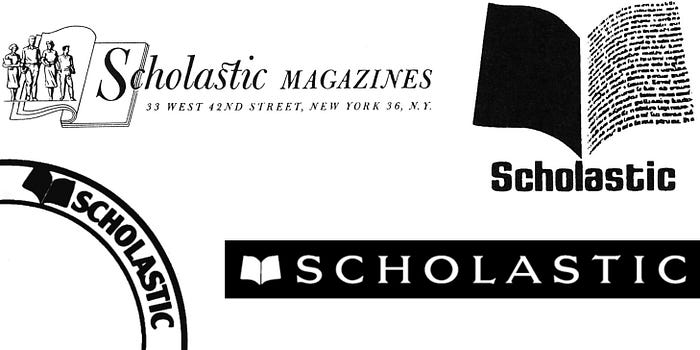
Scholastic (est. 1920)
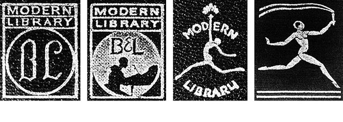
The Scholastic Publishing Company—founded by Maurice Robinson—began by publishing magazines and in 1926 started to manufacture books, but did not approach the establishment of a mark until 1940. The Scholastic Magazines logo — designed by Mary Jane Dunton — was widely used on business correspondence and financial documents but not utilized to brand books or magazines. In 1970 Scholastic adopted the flying pages — which were designed by Morton Goldshow — as its first public facing trademark. Dick Robinson — the son of Maurice, and current CEO — strongly advocated for the adoption of the pages. The flying pages were eventually set into an arc that was anchored to the lower corner of covers. In 1986 the identity was updated by longtime creative director Russell D’Anna, who straightened the arc and placed the flying pages within the now iconic red bar to the left of the company name — which is typeset in Newtext Demi-bold.
Phaidon (est. 1923)
Dr. Bela Horovitz and Ludwig Goldscheider founded Phaidon in Vienna and began by publishing a collection of Plato’s works translated into German. Phaidon is the name of the student who narrates Plato’s dialogue on the soul (Phaidon in German; Phaedo in English). Horovitz borrowed the student’s name for his firm and the Greek letter Phi as its mark. The letter Phi is also used to reference the number Phi (1.618) — also known as the divine proportion or golden ratio—which reflects the importance that Horovitz placed on design.

Simon & Schuster (est. 1924)
Richard Simon and Lincoln Schuster stumbled upon “The Sower” — a painting by Jean François Millet — as they strolled through a gallery during their first week of publishing. It occurred to them that the image of a man sowing grain was the perfect publishing metaphor for “planting seeds of wisdom.” So they hired John Everett Millais to render a reproduction of the painting for their colophon. This story suggests that they were possibly unaware of the long tradition of using agricultural symbolism to brand presses. Two examples being Jean De Tournes (est. 1542) and J. Roffet (est. 1549).

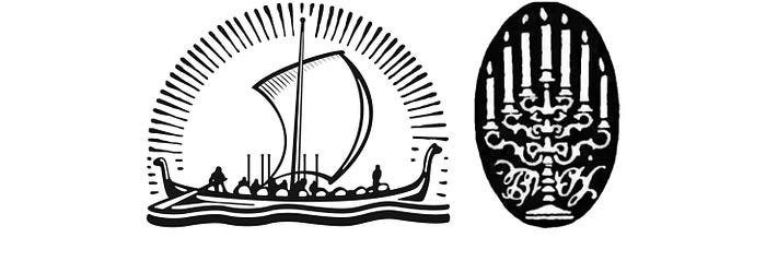
Viking (est. 1925) and W. B. Huebsch (est. Approx. 1914)
In 1925 Harold Guinzburg envisioned the Half Moon Press, named after Henry Hudson’s famed ship. He hired Rockwell Kent to render the vessel but Kent delivered what could only be interpreted as a Viking longboat. Initially angry that Kent had missed the mark by such a wide berth, Guinzburg eventually changed course, embracing the Viking ship and name as a symbol of enterprise, adventure and exploration in publishing.
In 1925, before publishing a single title of their own, Viking acquired the firm B.W. Huebsch, providing them with a strong backlist and the expert advice of Benjamin Huebsch himself. The Huebsch colophon featured a seven candle candelabra, which resembled a menorah. Being the son of a Rabbi, Huebsch may have designed a candelabra to pay homage to his faith.
Random House (est. 1928)
In 1928 Bennett Cerf and Donald Klopfer published their first book — Candide by Voltaire. The limited edition volume was illustrated by Rockwell Kent — who had unintentionally charted a new course for Viking three years earlier. Rockwell included a picture on the colophon of the house where Candide lived at the end of the book. The drawing was lifted from the book and used to brand all of their subsequent titles.
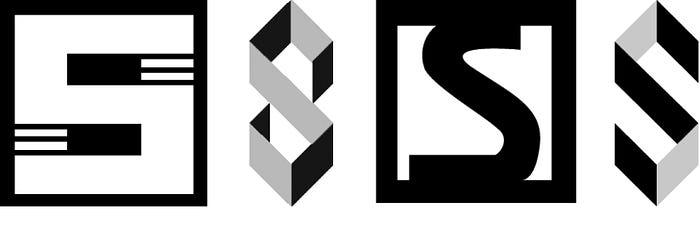
Schocken Press (est. 1931)
Brothers Simon and Salmon Shocken began by founding a department store in 1926. Salmon branded the store with a distinctive “S,” inspired by the geometric style of Piet Mondrian. Reportedly, he designed the mark himself — the store’s initial advertisements were executed by László Moholy-Nagy. Then in 1931, two years after Simon’s untimely death, Salmon founded Schocken Press and branded it with the same “S” that had marked the store. Over the course of its life the original Schocken “S” was used to sell both books and pots. When Salmon passed away in 1958 his son-in-law T. Herzl Rome rebranded the firm to mark the signal change. The “S” was reimagined again in 1987 by Louise Fili and in 2011 Rome’s “S” was revived and refined by Peter Mendelsund. Today Schocken employs a flexible brand strategy by blessing the use of all three marks.
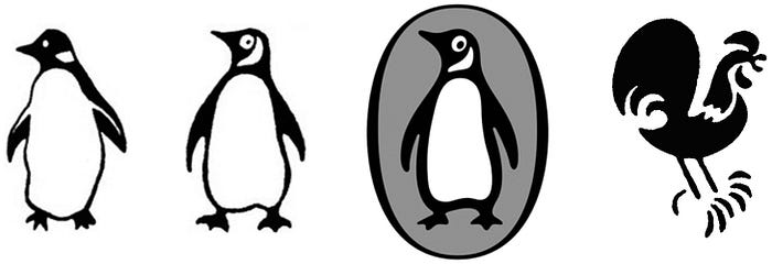
Penguin (est. 1935) and Bantam (est. 1945)
20 years after Alfred chose the Borzoi — Allen Lane decided that his new house should also be branded with an animal. His office manager suggested Penguins because they are “dignified, but flippant.” Lane sent Edward Young — a 21-year-old with some drawing experience — to the zoo. Upon returning, Young reportedly said, “My God, how those birds stink!” and the mark was set. Fourteen years later Jan Tschichold evolved the bird and brand strategy into a beacon of excellence in book design. And 54 years after that, Pentagram refined it further still.
In 1939 Lane tapped 23-year-old Ian Ballantine to head up Penguin’s U.S. office. While running that office Ballantine identified a need for paperback originals — his graduate economics thesis was on the potential of paperbacks — but Lane didn’t agree. So Ballantine left Penguin to form his own house, which he named Bantam books. A bantam being a louder, prouder show bird, it appears the choice was made to mark the start of Ballantine’s campaign to disrupt the publishing pecking order.
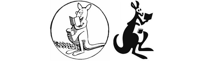
Pocket Books (est. 1939)
Richard Simon, Lincoln Schuster and Robert De Graff hired Frank J. Lieberman to design the first 10 covers for Pocket Books. It came to light during that process that the firm lacked an identity and so Lieberman drew a kangaroo reading a book with a second tucked into its pouch. They paid Lieberman an additional $25 (equivalent to $422.36 in 2016) for the logo. Lieberman was also responsible for naming the kangaroo Gertrude — after his mother-in-law.
Pantheon (est. 1941)
The story of Pantheon is the story of Kurt Wolff. In 1908 Wolff began his publishing career at the age of 21 as the silent partner of Ernst Rowohlt. Four years later his name was on the colophon and in the 18 years that followed he made an indelible mark on the history of celebrated literature. Under financial and political pressure he was forced to retire from publishing in Germany in 1930 and left to live in France and then Italy. The 1930s were colored by fear, as Hitler’s horrific agenda unfolded across Europe — the Nazis destroyed many of Wolff’s titles in the book burnings of 1933. In 1941 Wolff fled Europe and landed in New York City. Immediately upon arrival he was presented with the opportunity to begin a new publishing venture. America had already entered WWII, and Wolff was technically an enemy alien, so he felt it would be unwise to use his name for the firm — he wasn’t even officially its head. Thus he incorporated his new business as Pantheon Books, Inc. perhaps intending to reference his time in Italy.
Thames & Hudson (est. 1949)
Walter Neurath set up shop in both London and New York — naming his house after two of their rivers. Twin dolphins — without anchors — were used to represent the rivers. One facing East and one facing West — symbolizing a friendly, strategic connection between the new and old worlds.

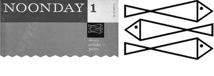
Farrar, Straus, & Giroux (est. 1960)
The three fish of Farrar, Straus, and Giroux were pulled directly from Noonday Press upon its acquisition in 1960. They had been employed as a device on the cover of Noonday’s short-lived, self-titled literary magazine, which was edited by Noonday’s founder Cecil Hemley and published during 1958 and 1959 in the lead up to the sale. The three fish were set above the same three words on the cover of each issue, “stories, articles, poetry.”
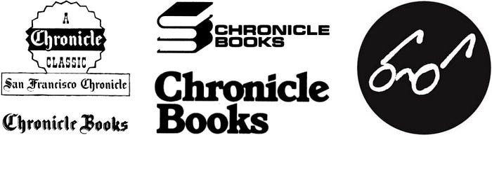
Chronicle Books (est. 1967)
Phelps Dewey — an executive at the San Francisco Chronicle — was responsible for expanding the company’s publishing stance to include books. Early marks drew a connection between the imprint and its newspaper roots. In 1991 then president Jack Jensen decided to pivot away from the logotype that was used at that time. He asked then — and current — creative director Michael Carabetta to explore other options. Carabetta tapped Tom Suiter who came up with the glasses as a playful reference to reading. When the mark was first launched in 1992 it was accompanied by the tagline, “We See Things Differently.”
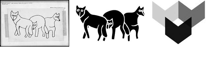
Graywolf Press (est. 1974)
Copper Canyon Press provided space for Scott Walker and Kathleen Foster to found Graywolf Press in Port Townsend, Washington. They chose to name the new press after the Gray Wolf Ridge, the Gray Wolf River, and the wolves indigenous to that area.
August House (est. 1979)
Bruce Wesson’s design firm drew the August House logo, which depicted the old stone house where the company was based. Ted Parkhurst — the firm’s founder — suggested adding the table lamp in the window for warmth.

As publishers press forward into the quick shifting twenty-first century they will increasingly rely on merger and acquisition to hedge against an uncertain future. Mike Shatzkin — son of legendary publishing executive Leonard Shatzkin, and founder of a company which analyzes the book industry — recently told the New York Times “I’d be so bold as to say we’ll have two big trade publishers 10 years from now, and no more.” Many publishing brands will be combined or abandoned in the near future as the industry converges under pressure from the digital era. But the stories unearthed above reveal that these identities have been in flux for centuries — long before the death of print became a point of speculation. One thing is certain: publishing’s brands will continue to be farthest from our minds when we’re lost in a book.
Acknowledgments
In addition to the works cited below the stories told above were researched and refined thanks to the generous assistance of Michael Carabetta, Scott Clemons, Russ D’Anna, Altie Karper, Chip Kidd, Ralph LaRossa, Maureen Mulligan LaRossa, Ted Parkhurst, Paul Soulellis, Marian Steffens, Deimosa Webber-Bey…
…and you. Proposed corrections and omissions are warmly welcomed.
Bibliography
David, Anthony. The Patron: A Life of Salman Schocken 1877–1959. New York: Metropolitan Books, 2003.
Epstein, Jason. Book Business: Publishing Past, Present, and Future. New York: W. W. Norton & Company, 2002.
Gress, Edmund Geiger. The Art & Practice of Typography. New York: Oswald Publishing Company, 1917.
Lippert, Jack K. Scholastic, a Publishing Adventure. New York: Scholastic, 1979.
Mackay, Ralph. Publisher’s Devices: Harper & Brothers Passing the Torch. chumleyandpepys.blogspot.com. Link (retrieved 6/18/16).
Michael, Ermarth. Kurt Wolff: A Portrait in Essays & Letters. Chicago: The University of Chicago Press, 1991.
Roberts, William. Printers’ Marks: A Chapter in the History of Typography. New York: G. Bell & Sons, 1893.
Thompson, John B. Merchants of Culture. Cambridge: Polity, 2010.
The Book Buyer: A Summary of American and Foreign Literature, Vol V. New York: Charles Scribner’s Sons, 1891.
The Book Buyer: A Summary of American and Foreign Literature, Vol VII. New York: Charles Scribner’s Sons, 1891.
Vit, Armin. Triangle is As Triangle Does. underconsideration.com. Link (retrieved 6/18/16).